

Overview
Multicolor Mind
Understanding mental illness on a human level
Fall 2018 // 5 weeks
CMU Programming Course
Individual Project
Problem
Though mental illness is prevalent in America, it isn’t talked about; even today, the subject remains taboo. When people do talk about mental health issues, it is in often in a clinical way, ignoring experience of the individual. All of this leads to stigma and misconceptions about those living with mental illness.
Solution
Multicolor Mind is a an educational, responsive website meant to de-stigmatize mental illness by helping users put themselves in sufferer’s shoes. People’s minds and mental realities come in many colors; this site educates users about mental health and helps them understand how others experience the world.
Live at https://ggayles.github.io/.
Languages/Libraries
HTML, CSS, JQuery, Chart.js, Bootstrap components
Tools
Github, Sketch, Adobe Illustrator
Role
As this was an individual project, I created all aspects of the site, from visual design to coding.
Background
DESIGN ROADMAP


“It is an odd paradox that a society, which can now speak openly and unabashedly about topics that were once unspeakable, still remains largely silent when it comes to mental illness.”

PROJECT CONTEXT
How might we help people understand the experience of those living with mental illness?
1 in 5 US adults has experienced mental illness in the past year. Yet despite it’s pervasiveness, mental illness is hardly talked about; it is not required to be taught about in schools, and sufferers are often told that they need to “suck it up” because “it’s all in their head.” People don’t understand what it is like to have a mental illness; they don’t understand that the sufferer’s reality is very different from their own. To make things worse, most websites that discuss mental health disorders look at them through a medical lens, listing symptoms and treatment options rather than helping readers empathize with people’s experiences.
I created a responsive website over the course of 5 weeks in order to help people, specifically those who know little about mental health disorders, understand and empathize with mental illness sufferers. The site aims to de-stigmatize common disorders and eradicate any misconceptions, emphasizing that these disorders alter the way people experience reality in a way they often cannot control. Multicolor Mind uses animated fictional characters “suffering” with mental illness to guide the user through their subjective experiences. These interactive animations combined with simplistic descriptions make the topic more approachable and engaging.

Process
1. Competitive Analysis
OTHER EDUCATIONAL TOOLS
The project began with a review of existing educational websites focusing on the topic of mental illness. Popular sites included WebMD, NIMH (National Institute of Mental Health), and MayoClinic. Example webpages from these sites are shown below.
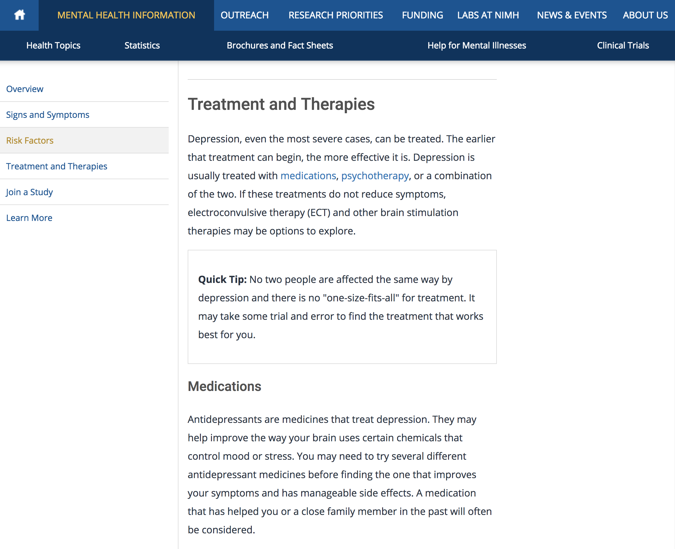
NIMH website, depression education page. Focuses on symptoms and treatment.
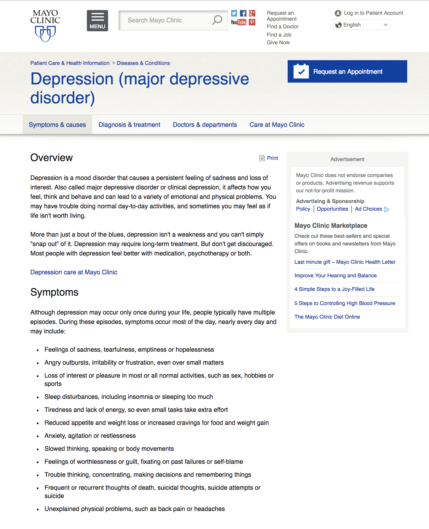
Mayo Clinic website, depression education page. Again, focuses on symptoms and treatment.

WebMD, depression education page. Like the other sites, highlights symptoms treatment, as well as prevention.
TAKEAWAYS
Most mental illness educational websites adopt a clinical perspective.
As evidenced above, these sites focus on symptomatology and treatment options rather than unique individual perspectives. They use formal, medical language instead of the descriptive, experiential language required for users to understand these disorders on a human level.
The human element is missing.
These sites failed to educate users about what it actually feels like to live with a mental illness. This inspired me to address mental health disorders from a more personal and empathetic perspective, helping users understand daily life of those living with a disorder. I decided to target people who have little knowledge and experience with mental health disorders, building a website that would fill the educational gaps left by the websites above.
2. Paper Prototypes
MOBILE FIRST DESIGN
I decided to focus on three common mental health disorders: major depressive disorder, bipolar disorder, and schizophrenia. I created paper prototypes to easily and quickly test my initial design. As all the disorder pages follow the same format, I only prototyped one sample flow (major depressive disorder). I used a mobile-first strategy, designing first for small screen sizes, including minimum necessary information to prevent cognitive overload and ensure clarity.
I tested with three users in my target audience (people who have little education about/experience with mental health disorders).

click on each image to see a more detailed view.
TAKEAWAYS
The site’s fictional characters are engaging.
Users enjoyed learning about mental illness through the lens of fictional characters, and they thought the ideas for animation were fun and effective.
There is too much clicking.
However, they said the site needed to flow better; there was a lot of clicking from page to page that disrupted the viewing experience.
The “real world experiences” page isn’t interactive enough.
Users found this portion of the site to be boring; a simple text list of quotes was a sharp contrast to the highly interactive, image-heavy design of the rest of the site.
3. UI Design

Site Map made in Sketch for the depression section. The other disorder pages follow the same format.
A HI-FI GUIDE FOR WEB DEVELOPMENT
Taking user feedback from paper prototyping into account, I constructed screens in Sketch and created a high fidelity site map for my responsive website. This served as an aesthetic and structural guide for the web development process. The following are key changes were made from paper prototype to the hi-fi sketch prototype:
Consolidated the information about each disorder into a single scrolling page.
This allowed users to easily move through sections, creating more fluidity and cohesiveness in the UX.
Added more interactivity and content to the “real world” section
By allowing users to view statistics and scroll through a carousel of quotes instead of just listing them, this section became more engaging.
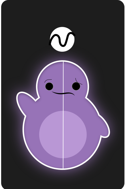
During this phase, I also created final versions of characters representing each disorder in Adobe Illustrator.

Schizophrenia

Depression
Bipolar Disorder
Final Design
4. Coding & Implementation
With the site aesthetics and content-flow nailed down, I began coding out the site. I used HTML, CSS, and JQuery, as well as external libraries like Chart.js and Bootstrap components. Animations were made with plain CSS and JQuery. The final site is hosted on Github.
MULTICOLOR MIND: AN EDUCATIONAL WEBSITE
Understanding mental illness on a human level
Multicolor mind is a responsive website meant to de-stigmatize mental illness and help people understand what it is like to live with certain conditions. The site uses animated characters, bold color, and an engaging narrative to guide users through the experience of sufferers.

Site Overview
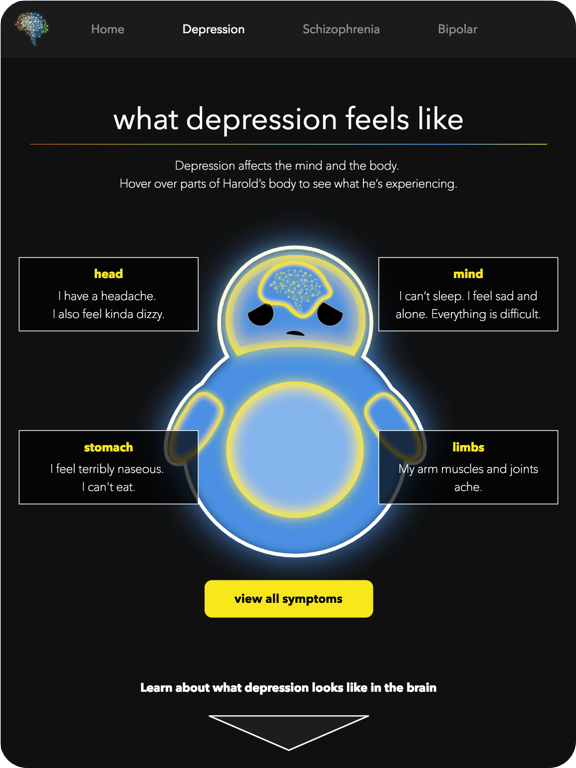
Users are educated about each mental illness through the lens of a fictional character. Each character has a specific name, associated color, and disorder they are suffering with.
Short descriptions are used to make the information simple to digest and accessible to all.
At the end of each section, the site sheds its fictional narrative and presents real-world statistics as well as quotes from actual sufferers. This is done to communicate to users that these disorders affect real people, not just fictional characters.
The site is called “Multicolor Mind” to suggest how diverse people’s mental realities can be, especially if they have a mental illness—the human experience comes in many shades. The bold use of color on the site pays homage to the title.
FEATURES
1. Animated characters


RATIONALE: I wanted the site to be engaging for users so they would more readily absorb the information presented. I thought using animated fictional characters would be a great way to do this. Animations make the characters feel more real, which creates visual interest and encourages empathy. This captures users’ attention and helps them put themselves in the shoes of those living with mental health disorders.
Further, psychology literature suggests that fictionalization can actually be more effective in empathy-building than telling true stories, especially when tackling sensitive subjects. This is because people are more likely to forget their ego/biases and loose themselves in the content if it is fictional. Thus, using fictional characters on Multicolor Mind makes for a more compelling and immersive educational experience.
2. Hover-able brain and body regions


RATIONALE: Users can hover over the character’s body and brain to see how mental illness has affected each region. This not only makes information discovery more exciting—users feel as though they are unlocking hidden knowledge—but also prevents clutter/information overload.
3. Long scrolling

RATIONALE: The long scrolling format enables the user to quickly move between sections on each page. This makes the website easier to navigate, as there are not multiple screens that the user has to click through, thus creating a more unified, fluid feel for the user.
RESPONSIVE DESIGN CHALLENGES
1. Problem
The main challenge in making the site responsive was deciding how the hover-able brain and body pages should behave on small, mobile-sized screens. One mobile, there wasn’t enough room to display all the information shown on larger screens, and the brain and body regions were too small for accurate mouse pointing.


2. Solution
Hover/click functionality is disabled on the symptom pages once the screen gets too small to effectively engage in this interaction (phone-sized). Instead, permanent labels appear over each brain/body region and a description of symptoms is shown beneath the character. This way, I avoid screen clutter as well as Fitt’s Law issues with target size.


Click below to visit the live Multicolor Mind site, hosted on Github.
REFLECTION
What I Learned
If something is taking forever to code, there is probably an easier way to do it. I learned this the hard way; I often spent hours coding something that could have been accomplished in one or two lines.
Always ask for help. Especially when it comes to programming, sometimes you have to swallow your pride and ask for help. By asking experienced programmers for advice, I saved countless hours of googling and learned some pretty neat tricks.
What I Would Change
Make it actionable. If I had more time for this project, I would consider how to make the educational insights taken from my site more actionable, perhaps by including a “get help” or “learn more” page.
More User testing. If time and resources allowed, I would test my website with more users—particularly teens, who I think would really benefit from education on mental health disorders. Unfortunately, I couldn’t test people under the age of 18 for this project due to legal restrictions.